cross-posted from: https://lemmy.dbzer0.com/post/27579423
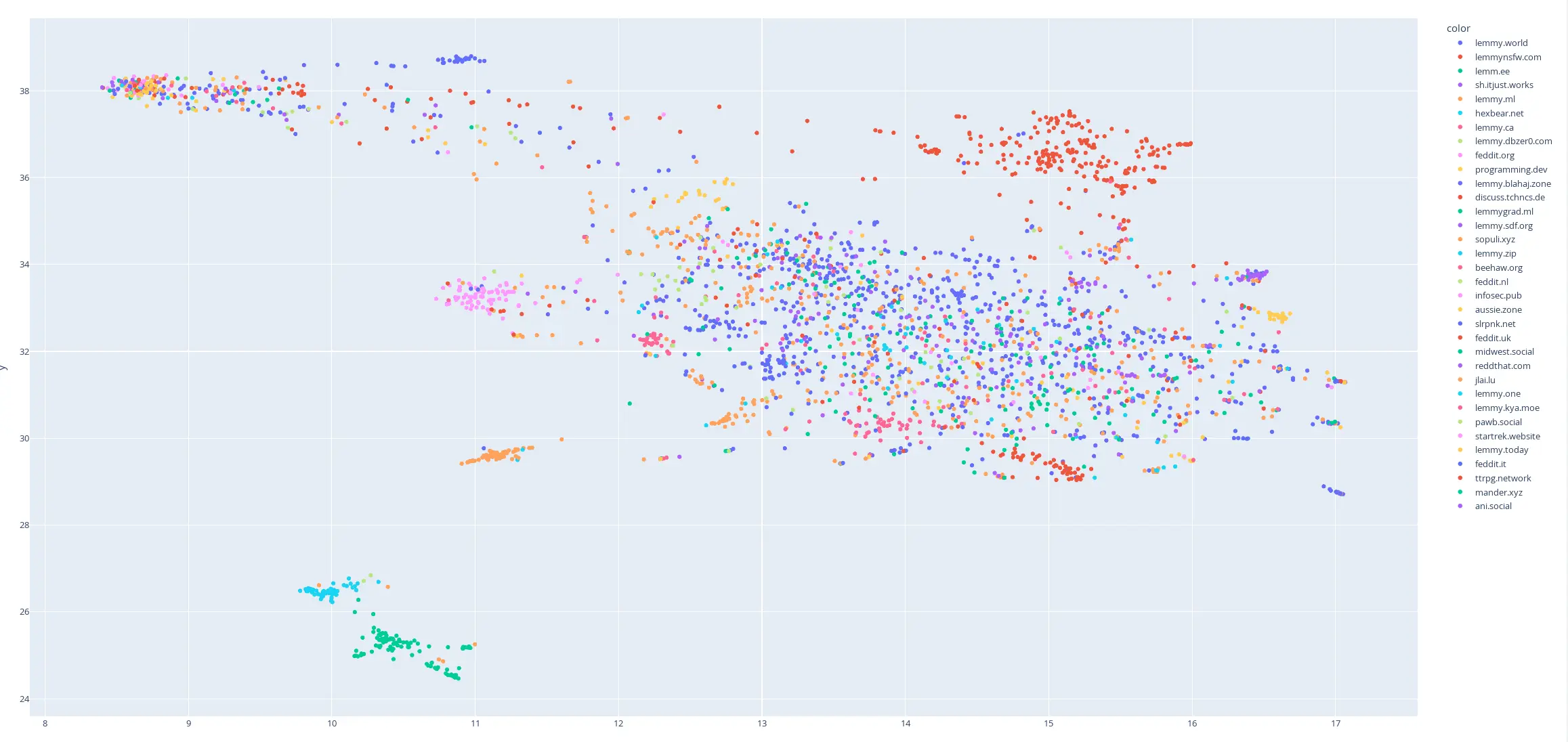
This is my first try at creating a map of lemmy. I based it on the overlap of commentors that visited certain communities.
I only used communities that were on the top 35 active instances for the past month and limited the comments to go back to a maximum of August 1 2024 (sometimes shorter if I got an invalid response.)
I scaled it so it was based on percentage of comments made by a commentor in that community.
Here is the code for the crawler and data that was used to make the map:
Can anyone ELI5 what the axes mean?
One is labelled Y.
I’m assuming the other is X… but might be Z if they’re fun
I pretty much only browse /all , so I’m throwing the numbers off! I don’t know myself with which communities i interact most.
Yeah I’ve noticed there aren’t many clusters that encode specific ideas (there are a few like the anime, nsfw, or sometimes instance level clusters). Most of it just seems to be a blend. Sorta disappointing.
Are they clustered based on shared userbase?
Yeah pretty much. There is also a weighting based on the percentage of comments in that community that come from that user.
There’s not enough data yet for the noise to cancel itself out, I think.
Place and language-specific clusters are pretty coherent, if you go looking.
webGL is not available in my Browser :(
Most of the value comes from the labels which require the webGL though
deleted by creator
that’s just poor cropping. The horizontal axis is labelled “x”
I’m finding new communities I want to explore from this thing. Very neat!
Hey everybody, the fascism apologists are way down there in the corner! Let’s all point and laugh!
This is cool, keep adding more features. Not sure if my comment wishing this existed inspired you but nice to see a proof of concept!
Actually it did so thx for that.
Assuming you’re continuing to develop this, maybe try displaying it like a bubble graph with posting frequency being the bubble size, and having nodes show all of the community names inside the largest bubbles at a particular zoom level.
Allowing the user to sort the data based on different criteria would be useful too, and links between nodes showing size of shared userbase might be interesting although you couldn’t show the connection between all nodes at once. One quality of life feature that would be great is pinch to zoom in/out rather than the current selection zoom.
Would be great if eventually users could subscribe to communities directly through this as an interface.
Keep up the good work! Thanks for considering my idea!