FatCattoTechnology@lemmy.worldEnglish·7 months agoThe DMA already having an impact. Brave Browser installs surge after introduction of browser choice splash screen on iOS.(lemmy.world)imagearrow-up11.16Karrow-down176message-square275file-textfedilink
arrow-up11.09Karrow-down1imageThe DMA already having an impact. Brave Browser installs surge after introduction of browser choice splash screen on iOS.(lemmy.world)FatCattoTechnology@lemmy.worldEnglish·7 months agomessage-square275file-textfedilink
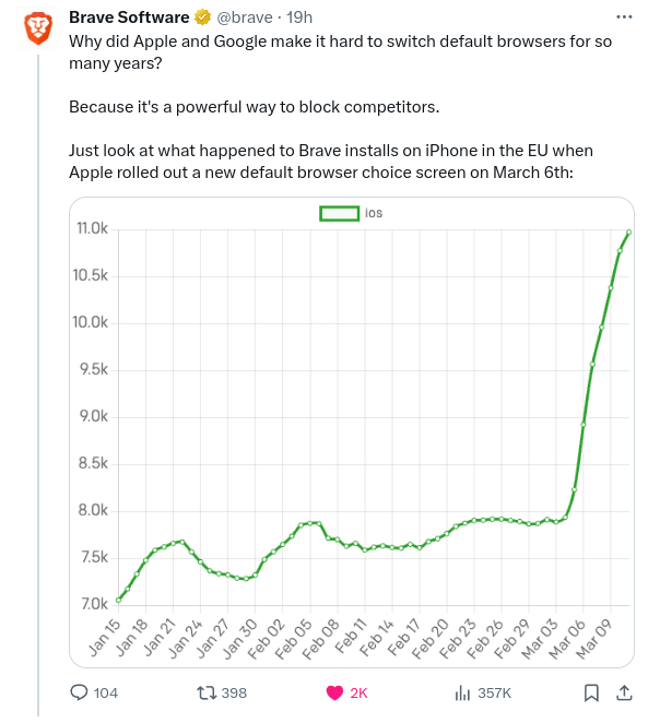
minus-squarenikschaEnglisharrow-up46arrow-down1·7 months agolinkfedilinkI hate how they cut off the graph…
minus-squarehalf_built_pyramidsEnglisharrow-up13arrow-down0·7 months agolinkfedilinkYeah, that graph is sus af
minus-squarekyleEnglisharrow-up5arrow-down0·7 months agolinkfedilinkAt least it’s drawn to scale, but yeah I get it. Starting at 7k probably makes it easier to read.
I hate how they cut off the graph…
Yeah, that graph is sus af
At least it’s drawn to scale, but yeah I get it. Starting at 7k probably makes it easier to read.